Man Searching for Immortality/ Woman Searching for Eternity

eonztgeljxqmv8k4txct
Royal Academy of Arts, Photo taken by Peter Mallet

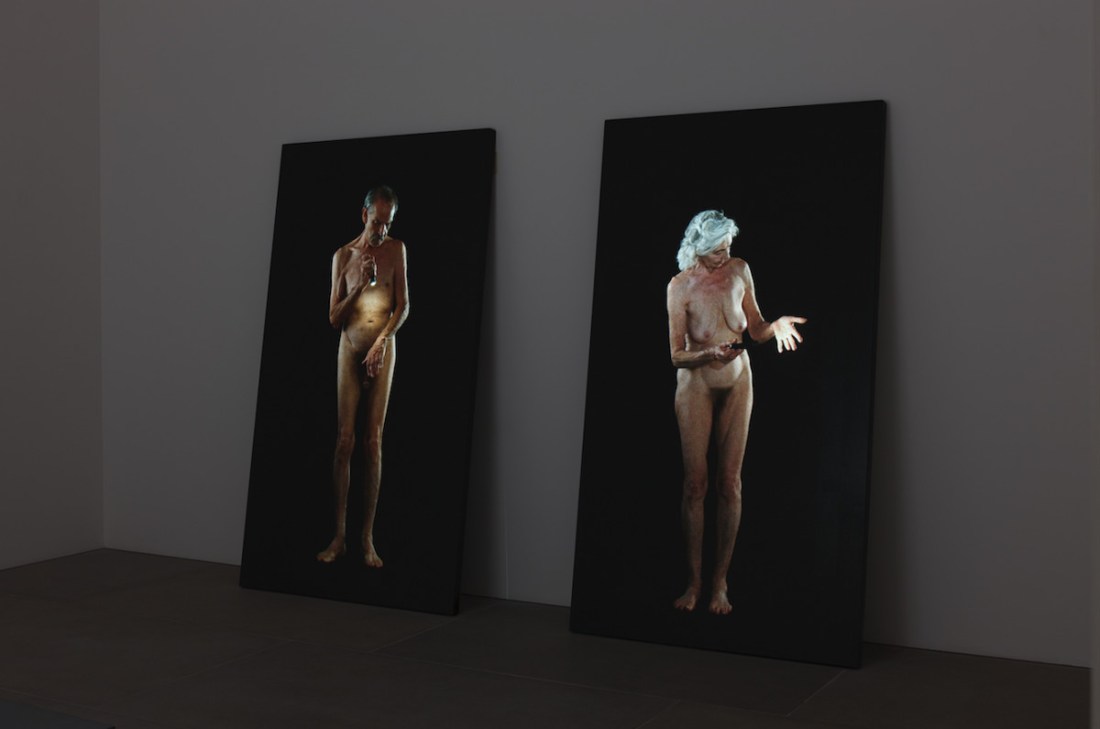
Upon entering the room where Man Searching for Immortality/Woman Searching for Eternity is displayed, I thought they were three dimensional moving structures. I first caught sight of the woman’s hand holding the flashlight and it seemed to be coming out from the flat surface of the video, facing me as the viewer. After moving into the gallery, i realized this was an optical illusion, but the video was brilliantly placed on black granite and gave the flat video an added depth that was able to make it more realistic. The figures depicted are slowly, methodically searching their bodies with a single flashlight. The black background and an eerie source of light highlights the contours of their bodies. Choosing to have a solid black background isolates the figures. The piece is solely based on the figures and their search, nothing else is there to hinder the interpretation or distract the viewer. The figures seem calm and steady in what they are looking for, which is somewhat suggested to the viewer by the title of the video. The title proclaims they are searching for immortality/eternity, but also asks the question of the difference between the two words and why a man is searching for one, a women the other. Immortality is eternity in context to a person’s life, while eternity is talking about time in general. It is curious that the woman is searching for eternity and the man immortality–it seems as if the woman is concerned with things beyond herself and the man concerned about time as it pertains to him and his life. They are both searching their bodies in the way many people look in the mirror and search for any signs of aging, worried as to what that means for them and their life. These figures are not searching for aging, however, as it is already evident in their skin and they would have already discovered it, but they are searching for an eternal life. From the title, I believe that the piece is hopeful, the figures are searching for any signs of life beyond their bodies (i.e. the soul) after they have confirmed their age and what that means for longevity of their lifetime. The age of the figures represents the time in a human life where people start to search for such things. When death seems close, people become more concerned with an afterlife and begin to search for it.

The video was made in 2013 by Bill Viola after a trip in 2006 to Windsor Castle. Viola was moved by Michelangelo’s viewpoint of the human body encapsulating the soul, it’s eventual perish, and what that meant for the soul (Royal Academy). Throughout Viola’s work he is concerned with the passage of time and claims it to be his overarching medium, not video. He states that everything develops with the passage of time, and through that his videos are able to function through duration and the corresponding thought process. In video work, I do believe duration is an intrinsic factor. A viewer’s interpretation of the video is shaped by time, how long they are watching the video, their thought process developing during that time, when they start watching the video and what they might miss. In my experience, I only saw the two figures searching their bodies, but other patrons were able to see the figures fade into the screen and walk away, receding into the background. Time changes the viewer’s perception of the video and therefore their consciousness, as Viola has proven.


Whaam!

IMG_4033
Whaam! at the Tate Modern

In looking at Whaam!, It’s hard to realize that technically, you are watching someone perish. The painting is able to encapsulate a time in American history where media coverage and war are first interacting–never before in history has a war been broadcast on television and this time, it was making the American population weary of it. Since the Vietnam war, as anyone living in present day society can tell you, consumers of media have since become numb to it. Was Lichtenstein able to predict the future media culture just at the advent of it? Whaam! functions as an allegory for today’s mass communication.

Whaam! was created from a comic strip in DC comics’ “All American Men of War” that was published in 1962 (Tate). In the nature of pop art, the painting is taking the mundane and elevating it by making art out of it–the ‘mundane’ being the comic and ‘elevating’ it to fine art (mainly meaning art on a canvas). It is an opinion of some though, that he has stolen the comic and slightly altered it, but Liechtenstein states “‘I am nominally copying, but I am really restating the copied thing in other terms. In doing that, the original acquires a totally different texture’ (Tate). 

Whaam-Sabre-Panel
downthetubes.net

 While the similarities are undeniable, it is different from the comic by including an appealing design–the lines are thick, distracting cross hatching is removed, and the colors are solid in order to make a simplified and more streamline composition. The resulting picture has a clean and almost sterile look with structurally organized benday dots aligned in neat lines.

The ‘clean’ or sterile look resulting from the meticulously structured painting completely removes it from the subject matter at hand–yes, someone is dying in the painting, but no part of it is gruesome. It is clean, playful, and pleasing to the eye with it’s use of primary colors. Blue and red elegantly sit next to each other to make a purple shadow on an elegantly blue sky. The depiction and the subject matter directly contradict each other, making something seem peculiar to the viewer upon further inspection.

Liechtenstein has accurately captured a moment of time in history, a painting embodying it’s environment and time period. One of Liechtenstein’s favorite paintings was Guernica by Pablo Picasso, a painting that also famously provided commentary on war, reflecting on the feelings of the the people in that country (Lichtenstein Foundation). Today, Whaam! is still relevant–there is an excess of media depicting gruesome deaths, epidemics, and other various horrific aspect of human suffering, yet we are numb to it. The media is able to repackage and sterilize the subject matter at hand, much as Liechtenstein is doing in Whaam! While the painting was made during one of the few times in American history where people were shocked by the war suddenly being shown in their living rooms, it predicted what future media consumption would be like. Whaam! is relevant during a time where people look at atrocities in the palm of their hand and feel completely detached from them. Media is repackaged and sent in easily digestible packages directly to out phones where consumers can feel comfortably indifferent to what they’re viewing.

Man with a Newspaper

IMG_3905
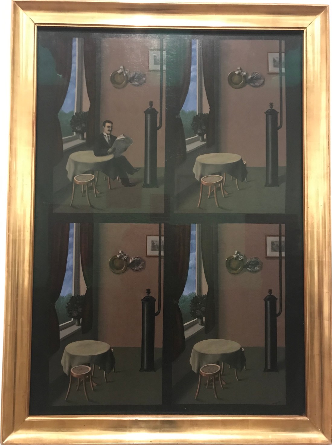
Rene Magritte was a surrealist painter from Belgium who aimed to question our relationships with objects and language. Magritte pushed surrealism past the unconsciousness just having unhindered freedom with paint and made it something symbolic. Magritte choose to have a detailed and precise style that gives an unsettling style to viewers and created his ‘deadpan’ style of artwork (MoMA).
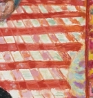
Magritte’s Man with a Newspaper is peculiar to any viewer from a considerable distance–as the viewer gets closer, however, uneasiness increases. The painting seems like a game of spot the difference, as there are only subtle differences between each panel, and left for the viewer to decide if they are intentional or not. There are small, unsettling and almost unnoticeable differences in the painting such as a slight shift in perspective and shadow, even though it appears to be the exact time of day (according to the clouds outside, which have not moved). Of course, the one thing that does change, is the man reading the newspaper in the first frame–suddenly, he just is not there in the consecutive three frames. The viewer is forced to wonder why he disappeared suddenly, without any movement indicated in the painting, and why he was there in the first place. Painted in a distinctly surrealist style with an uncanny use of lighting and realism, the painting makes the viewer inquire beyond the literal image at hand, and perhaps what was happening in Magritte’s unconsciousness.

Man with a Newspaper was made in 1928 during the period of time Magritte lived in Paris and was making other images in the same style of provoking, unknown plots. During 1927 to 1930, Magritte was expremening with text and image, and most famously creating Ceci n’est pas une pipe (This is Not a Pipe) (The Guardian). Within each painting seems to be a direct contradiction, most notably in his text paintings that directly deny the image, but a common theme throughout his work. In Man with a Newspaper, the image seems to be contradicting itself–how could the man have moved? He should still be there, but the three other frames deny it. Even through the style of surrealism, the lighting is also contradicting itself. In reality, the sky that shown in the windows outside would not be capable of producing the lighting in the household. The effect of lighting and the theme of the contradictory gives Magritte’s style an unsettling, almost matter of fact feeling that is bound to make the viewer second guess the objects at hand.

golconda.jpg
The men in this painting seem very similar to the figure in Man with a Newspaper, Rene Magritte.org


A common Motif in Magritte’s paintings are men in suits with bowler hats–they can be seen in many paintings, and the men seem to resemble each other. A Man with a Newspaper is no exception, and looks similar to other figures in Magritte’s paintings. Magritte himself was often seen wearing bowler hats and dawning a similar suit–it is possible these figures are meant to be a reflection of himself. A common interpretation of his works are that they reflect on his mother’s death that he witness as a child, apparently found covered in fabric after she had drown (The Washington Post). Whether or not these aspects are biographical to Magritte’s life, he is painting as a surrealist, someone who is painting from their subconscious and may not even know themselves. 

Coffee

Pierre Bonnard, Coffee, 1915

Photo © Tate, CC-BY-NC-ND 3.0 (Unported)

https://www.tate.org.uk

CoffeePierre Bonnard’s Coffee has an air of familiarity even from across a gallery, beckoning the viewer to examine closer, curious as to why they are drawn to the painting. The perspective of the painting makes it seem the viewer is within the painting, staring down at the table about to take a seat. The view is a snapshot of an intimate moment as if the viewer is capturing their Sunday afternoon through the lense of a camera.

Bonnard was a member of both the Fauvists and a creator of the Intimism movement in the early 20th century (Tate Modern). In being involved in these movements, Bonnard utilizes color not with a technique of precision, but one of feelings and interpretations. Recalling subjects from memory heightens the use of emotion through color, giving colors an undeniable emotional quality. Along with his use of color, Bonnard chooses subject matters that are familiar to him and his viewers alike. He chooses to paint the everyday, and all of the aspects that make up a lifetime.

For me, part of the reason the painting is so familiar is because it is painted through a memory, not a direct reference. Using memory as a medium makes things in the painting appear softer and less detailed, inviting the viewer to fill in the gaps. The style and choice of color in this painting is particularly powerful–it is one of the main vehicles for the tone of this painting. Most obviously, the two figures that are included with the tablecloth make up primary colors and give the painting a solid basis. Red covers the most real estate, creating a solid infrastructure of color for the painting. Bonnard states “If one has in a sequence a simple colour as the point of departure, one composes the whole painting around it” (Tate). In Coffee, the point of departure is made clear with the great expanse of red tablecloth as the figure’s clothing works with the red. While the tablecloth is most dominantly red, the whites in the design seem to reflect the colors around them–the figure’s shirt colors correspond subtly with the whites of the pattern. Digital_Image_©_Tate,_London_2014_N05414.jpg On the left side under the figure in the blue shirt, the whites in the pattern become tinted with blue and the same with the whites under the figure in the yellow. The artistic choice of combining colors seems to relate the figures to the table and make the painting cohesive. The shadows on the tablecloth take the unnatural color of blue but effectively gives the shadows depth and an interesting relationship to the cups and plates. The strip of wall on the most right side of the painting and in the middle are made out of yellow and purple, complementary colors that give the painting an enhancing frame. In the back of the painting, another painting is portrayed by the memory of the artist. The work in the background poses an interesting decision of the artist to paint another painting. The artwork in the background has been seen and absorbed by Bonnard, processed and sat in his memory, and replicated again. The process of replicating a painting seems particularly interesting–a painting is an artists presenting their viewpoint of a subject, but now that painting is represented again through a different artist and therefore different absorption of information. The tablecloth in the painting is also a replication of art, but more accurately a replication of pattern or design. It is interesting when artists portray other pieces of art, design, or decor because it takes on a kind of inception. The pieces intention is then repackaged again and presented a second time to the viewer, through a second artist.

All of the elements in Bonnard’s Coffee present a familiar rendering of what could be anyone’s Sunday afternoon. The painting is not making a powerful statement beyond the subject at hand, but a strategic evaluation of a memory through color. Bonnard welcomes the viewer into his memory, letting them situate themselves and relate.


Souls on the Bank of the River Styx

pnp12
Photograph from the Leicester Gallery

Souls on the Bank of the River Styx stick out of Edwarde Burne-Jones’ usual work due to it’s textured and gestural feel. The painting is depicting souls on their way to Hades and it is based on the Aeneid (Leicester Gallery). Compared to Jones’ other work, there is a startling lack of detail or environment in the painting. What this particular depiction of the underworld lacks in detail, it fills in with tone and emotion.

Jones is a pre-raphealite painter who passionately rejected industrialization, often depicting  fantasy worlds without any trace of modernization. This particular painting was created in 1873, when Jones was 40 (Tate). Like Jones’ other work, this painting does not hold true to the modernization of the world around it, but unlike other paintings this one is dark with little detail, possibly symbolizing a contemplative time in his life that is closer to the end of his career.

While the environment is mostly left ambiguous and for the viewer to fill in, a sense of perspective is carried through the painting. As the figures recede to the back of the painting, they appear smaller and more faded. The figures seem to be standing on a slightly reflective surface against the backdrop of a sky which is a light green around the figure’s feet, giving them depth and creating an aerial perspective. There is no definite horizon in the picture and the ground seems to bleed into a sky. The environment is composed of dark blue and green gradients–colors that are willing to blend with each other to make subtle changes in the atmosphere.

The figures themselves are painted as hunched over and in anguish, the stark white popping forward from the dark background. The darker parts of the figures are transparent and letting the background show through, giving them a wispy ghost like essence. At first glance, I thought it was a depiction of The Three Shades by Auguste Rodin. The men all have a posture signaling that they are in some sort of pain or despair and like Jones’, the men are also descending to hell. The dark tone of the painting leads to a mysterious feeling that initially attracted me–the lack of information and the added perspective is just enough to let the viewer imagine the place, but fill it in with their own details and fears of the afterlife.


Life Boat and Manby Apparatus

2006AG3590_2500.jpg
Photo from Victoria and Albert Museum

Life-Boat and Manby Apparatus Going Off to a Stranded Vessel Making Signal (Blue Lights) of Distress is a painting by Joseph Mallord William Turner. The title of the painting is very fitting in the sense that it is dramatic and precise in its description, effectively representing the painting. The object of the depiction is the employment of the “Manby Apparatus”, an apparatus that is meant to save wrecked ships in a storm and designed by Captain George Manby after witnessing a storm (Victoria and Albert Museum). The painting is demonstrating man’s fight and bravery in the face of nature’s most brutal attempts of destruction. While Turner is depicting a wonderfully sublime setting, he is also lending a hand to man’s brilliance and invention which leads to it’s ultimate survival against nature.

The painting is supposed to take place at Yarmouth Peer which is coincidentally where Constable has painted the same environment, speculating a certain competition between the two artists (Victoria and Albert Museum). This particular painting exhibits Turner’s fascination with industrialization in contradiction with the sublime–are man’s developments a match for nature? In this painting, Turner is exploring man versus nature through the use of color and composition. The dark colors can represent the sublime taking over, while the use of light on the right side of the canvas can represent hope and prosperity. The use of light directs our eye towards the figures on the beach who appear to be pointing and yelling in the direction of the crashed ship. Bright color and light guide our eye while also communicating a symbolic meaning of human prosperity. 

2006ag3590_2500
Photo from Victoria and Albert Museum

Not only does the environment suggest kinetic and potential motion due to the literal subject of waves, but the ship’s masts are sitting on a diagonal line of sight, implying that the boats are moving back and forth with the waves. The boat that is deploying to save the shipwrecked is also placed on a diagonal as it is depicted on the upside of a wave. The color of the clouds and beach are chosen to accurately represent distance in the painting. In the foreground is the beach, painted in a warm red and suggesting closeness to the viewer. In the back of the painting, the water appears a dark blue which not only suggests distance but presents the tone of danger.

If one has ever been stuck in a storm while stranded on a boat…they will recognize the immediate dread the picture provokes from the storm cloud on the left. Even if one is fortunate enough to not have this experience, a trip to the beach during a storm will do the trick. As someone who has been caught in a storm with no sight of shore–the painting does a wonderful job of capturing how naturally unequipped humans are for nature’s strength.

While Turner’s message is that man’s cleverness will fight for it’s survival against nature, he does not downplay nature’s power. The painting does not provide a clear “who won”, as the storm looks like it does have a good chance at swallowing it’s patrons. However, while the storm looks that fierce, it shows that humans are not discouraged by the possible treachery and constantly prevail with their advancements in technology.