Pierre Bonnard, Coffee, 1915
Photo © Tate, CC-BY-NC-ND 3.0 (Unported)
 Pierre Bonnard’s Coffee has an air of familiarity even from across a gallery, beckoning the viewer to examine closer, curious as to why they are drawn to the painting. The perspective of the painting makes it seem the viewer is within the painting, staring down at the table about to take a seat. The view is a snapshot of an intimate moment as if the viewer is capturing their Sunday afternoon through the lense of a camera.
Bonnard was a member of both the Fauvists and a creator of the Intimism movement in the early 20th century (Tate Modern). In being involved in these movements, Bonnard utilizes color not with a technique of precision, but one of feelings and interpretations. Recalling subjects from memory heightens the use of emotion through color, giving colors an undeniable emotional quality. Along with his use of color, Bonnard chooses subject matters that are familiar to him and his viewers alike. He chooses to paint the everyday, and all of the aspects that make up a lifetime.
For me, part of the reason the painting is so familiar is because it is painted through a memory, not a direct reference. Using memory as a medium makes things in the painting appear softer and less detailed, inviting the viewer to fill in the gaps. The style and choice of color in this painting is particularly powerful–it is one of the main vehicles for the tone of this painting. Most obviously, the two figures that are included with the tablecloth make up primary colors and give the painting a solid basis. Red covers the most real estate, creating a solid infrastructure of color for the painting. Bonnard states “If one has in a sequence a simple colour as the point of departure, one composes the whole painting around it” (Tate). In Coffee, the point of departure is made clear with the great expanse of red tablecloth as the figure’s clothing works with the red. While the tablecloth is most dominantly red, the whites in the design seem to reflect the colors around them–the figure’s shirt colors correspond subtly with the whites of the pattern. 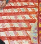 On the left side under the figure in the blue shirt, the whites in the pattern become tinted with blue and the same with the whites under the figure in the yellow. The artistic choice of combining colors seems to relate the figures to the table and make the painting cohesive. The shadows on the tablecloth take the unnatural color of blue but effectively gives the shadows depth and an interesting relationship to the cups and plates. The strip of wall on the most right side of the painting and in the middle are made out of yellow and purple, complementary colors that give the painting an enhancing frame. In the back of the painting, another painting is portrayed by the memory of the artist. The work in the background poses an interesting decision of the artist to paint another painting. The artwork in the background has been seen and absorbed by Bonnard, processed and sat in his memory, and replicated again. The process of replicating a painting seems particularly interesting–a painting is an artists presenting their viewpoint of a subject, but now that painting is represented again through a different artist and therefore different absorption of information. The tablecloth in the painting is also a replication of art, but more accurately a replication of pattern or design. It is interesting when artists portray other pieces of art, design, or decor because it takes on a kind of inception. The pieces intention is then repackaged again and presented a second time to the viewer, through a second artist.
All of the elements in Bonnard’s Coffee present a familiar rendering of what could be anyone’s Sunday afternoon. The painting is not making a powerful statement beyond the subject at hand, but a strategic evaluation of a memory through color. Bonnard welcomes the viewer into his memory, letting them situate themselves and relate.
